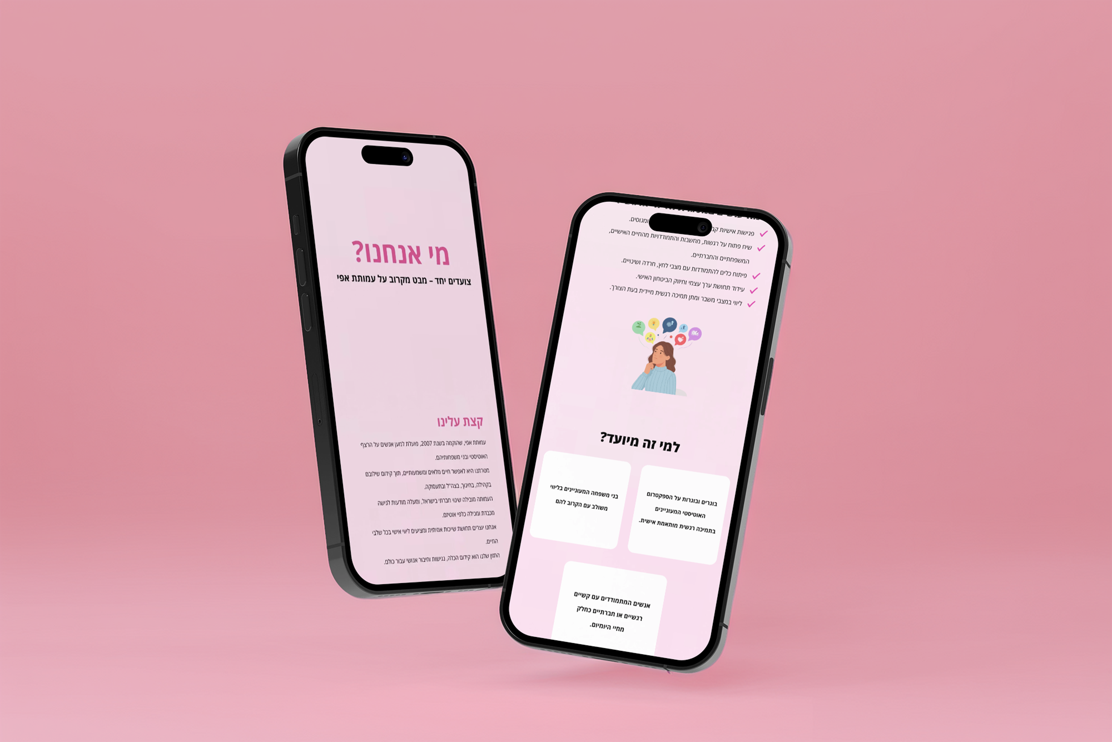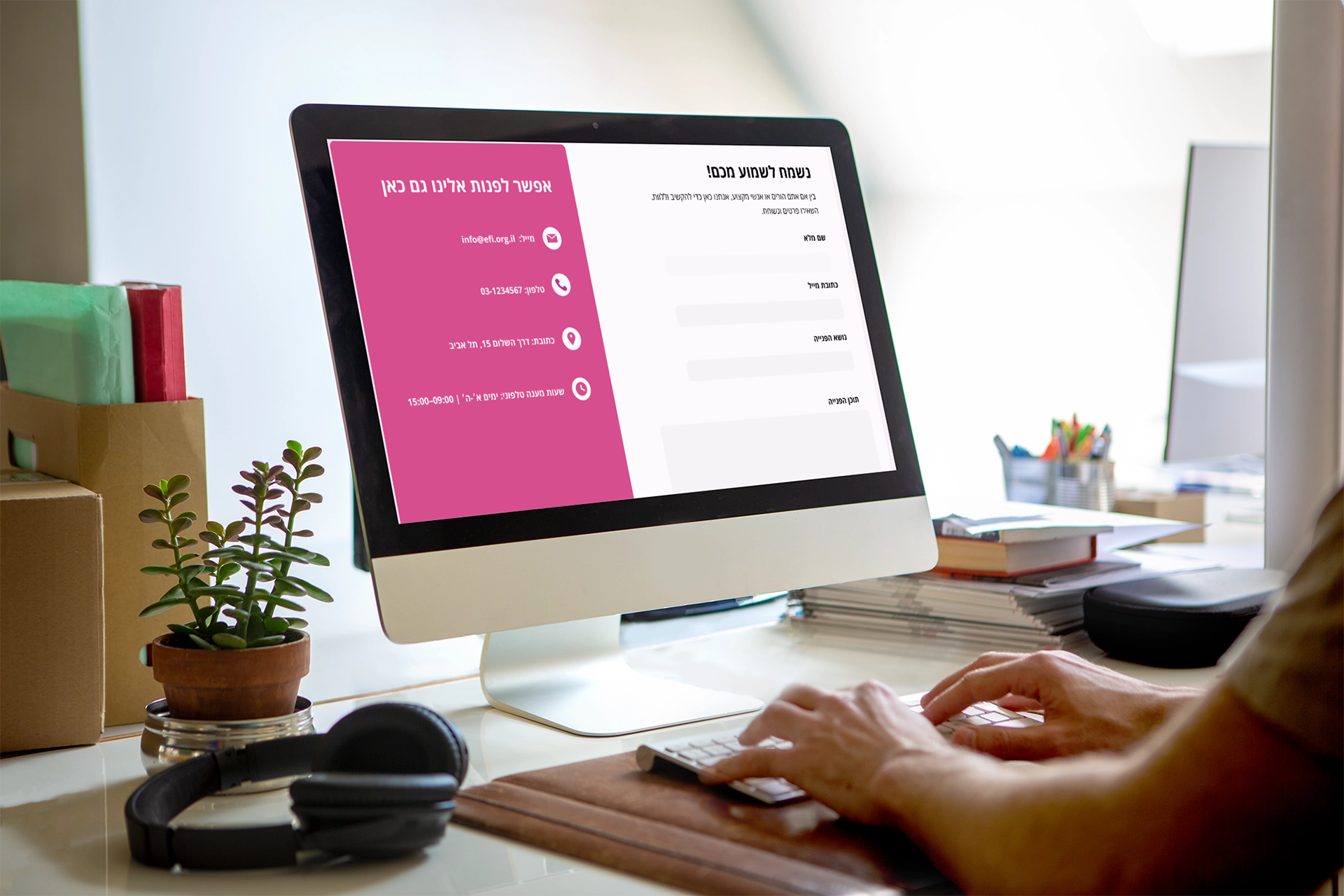
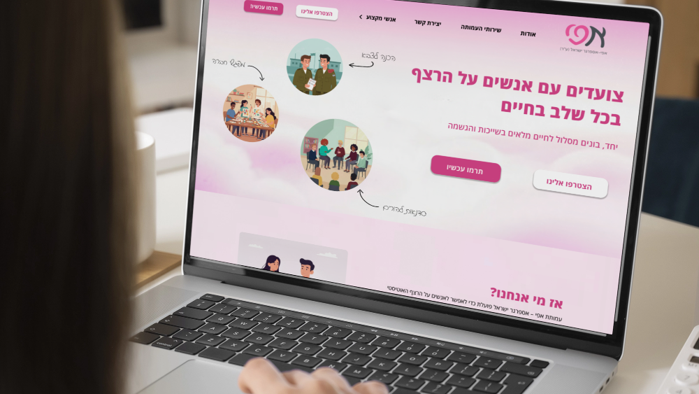
EFI is a non-profit organization dedicated to supporting individuals on the high-functioning autism spectrum and their families. The digital challenge was to redesign their web platform to move away from cold, institutional aesthetics and build a warm, highly accessible, and therapeutic digital ecosystem. The goal was to create a community hub that promotes well-being, encourages volunteering, and provides crucial support across a variety of important areas.
Design & UI/UX Strategy
The user interface was meticulously crafted using a calm, therapeutic, and optimistic design system to ensure inclusivity and comfort for adults on the spectrum, their families, and the volunteers who support them:
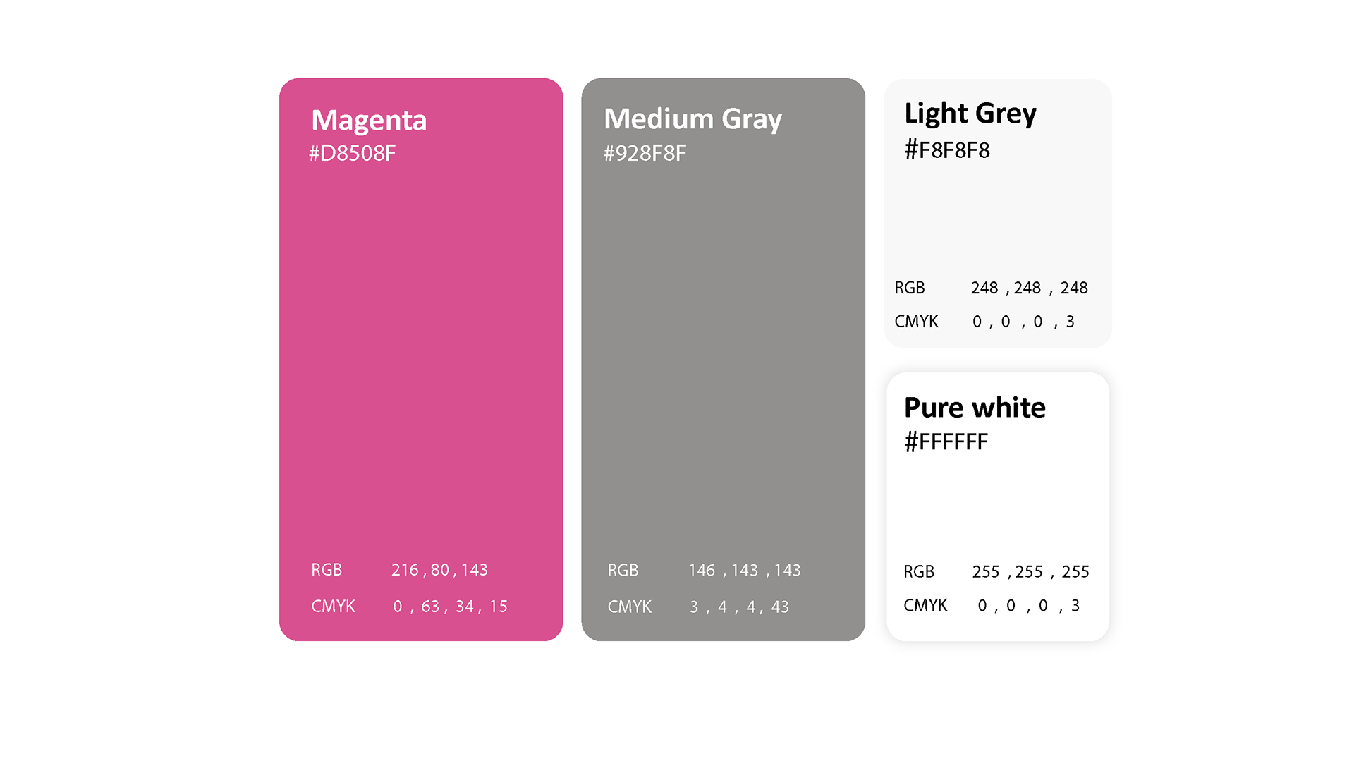
Color Psychology (Magenta, Medium Gray, and Light Grey): The vibrant Magenta introduces an energetic, hopeful vibe, balanced by soft, non-stimulating gray and white tones that convey a professional yet welcoming message without falling into childishness.
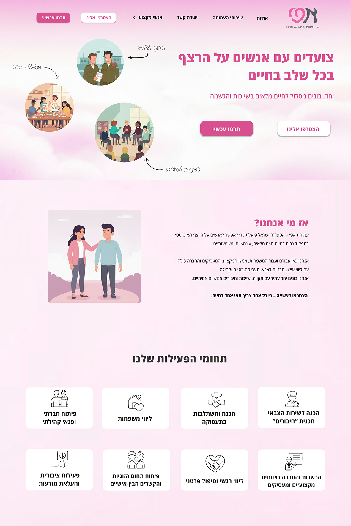
Micro-Interactions & Components: Developed interactive cards and components that smoothly change color from white to fuchsia pink upon hovering, providing clear visual feedback and seamless navigation for users exploring the association's areas of activity.
Mobile UX & Navigation: Built a fully responsive mobile interface focusing on clean, intuitive navigation, allowing users to easily open the responsive site menu by clicking the logo and tap to exit seamlessly.
Components
Hovering between the areas of the association when you move the mouse and the color changes from white to fuchsia pink
Opening the site menu by clicking on the logo and clicking on the page to exit the menu